Financial Time Series
This page demonstrates a Mathematica notebook for analyzing financial time series of equity prices. The notebook may be downloaded from http://pages.suddenlink.net/rhr/fft01/FinancialTimeSeries.nb It can be read with Mathematica or the free Wolfram CDF Player. While everything shown in the notebook can be done directly in Mathematica, the code in the notebook uses some other packages which are not generally available. Please contact me for the rest of the code if you would like to use the algorithms - this is an evolving work in progress. Bob Rimmer
Load Procedures, Packages, Notebooks
![]()
![]()
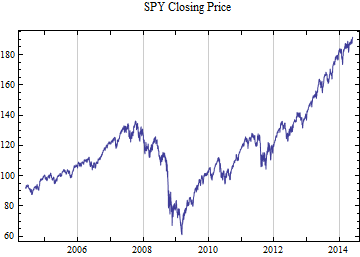
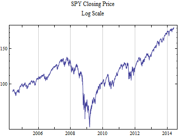
The time series plots on linear and logarithmic price scales.
Price time series often include the intraday high and low prices. These price ranges may be converted to a standardized measure by taking the Log[High/Low]. This measure gives an estimate of the intraday volatility.
![Graphics:Daily Log[High/Low] SPY](HTMLFiles/FinancialTimeSeries_5.gif)
![Graphics:Daily Log[High/Low] Five Day Moving Average SPY](HTMLFiles/FinancialTimeSeries_6.gif)
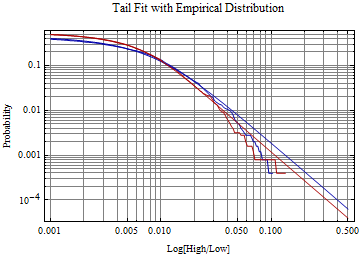
These data are typically well fit by a generalized extreme value distribution. Although volatility tends to cluster over varying time frames, a sample over a large time frame, will pick up the long term risk and tail behavior of the risk distribution. The fit to the right tail of the 1-CDF[GEVDistribution, x] versus probability is shown below on a log-log plot where the tail behavior of the Log[Range] typically becomes linear at the extreme. The GEV distribution in Mathematica is called the MaxStableDistribution[μ, σ, ξ] -- the parameters are shown below. In the plot the fit distribution is in red and the empirical distribution is in blue, showing the closeness of the fit. Aside from providing a useful method to model volatility over time, the statistical analysis of this measure as an intraday extreme may shed some light on the power tail nature of the underlying price formation process. If the extremes measured by the log ratio were being generated by a normal distribution process or even heavier tailed process like an exponential distribution, the parameter, ξ, should be close to zero. Instead ξ is almost always securely in the Frechet domain of attraction. The value is usually less than 1/2 suggesting that the distribution on summation should eventually lead to a normal distribution, however the underlying process still has far heavier tails than an exponential distribution.
![]()
![Graphics:Log[high/low] GEV Fit\nGEV Tail α: 2.63151](HTMLFiles/FinancialTimeSeries_8.gif)
Extreme Event Clustering
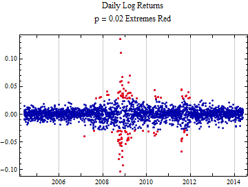
The graph below shows similar information in a different format. The dots are sequential daily logarithmic returns rather than the intraday measure Log[High/Low]. The dots in red are outside the probability range (0.02, 0.98). The main idea of this graph is to clearly show that extreme events are not evenly distributed across time as would be expected if the underlying price formation process were random. Instead there is likely a feedback loop in the process so that extremes tend to cluster. The point is that although it is possible to fit these data collected over a long period of time rather well to a particular distribution, the probabilities of events from that distribution will not have the same predictive value as they would if the events were being generated by a random process. So what follows should be used in practice with extreme caution. If you are operating in an epoch when extreme events are not occurring the procedures will over estimate risk. If you are in an epoch during which extreme events are occurring, risk will still significantly be underestimated because of the clustering of extreme events where an ordinary random process would expect extremes to be randomly distributed.
Stable 2:3 Order Distribution Model Fit
This distribution is described in more detail here: http://pages.suddenlink.net/rhr/fin05/MarketThoughtExperiment.html. This distribution tends to fit the tail behavior of stock market logarithmic returns very well. The distribution tail exponent, α, has support in a range (0, 4), but at exactly 4 it picks up the tail behavior of a normal distribution. Usually for U.S. market returns, α is in the 2.5 to 3.5 range. With a tail exponent at this level, sums of returns should eventually yield a normal distribution by the central limit theorem, but the convergence is slow, and in general convergence will not occur over even long time frames because of the non random clustering of extreme events. Financial returns are neither identically nor independently distributed over time. And this slow convergence aspect of market tail behavior by the central limit theorem is lost entirely if one mistakenly assumes an underlying normal distribution. It is possible to use the FFT to calculate the convergence over varying intervals, but doing this requires that the assumed market behavior remain similar to the data epoch and that events occur independently. The next section of this notebook will demonstrate how to do this, but the main value in the exercise is to show the effect of the tail behavior in a randomized setting rather than in the real world.
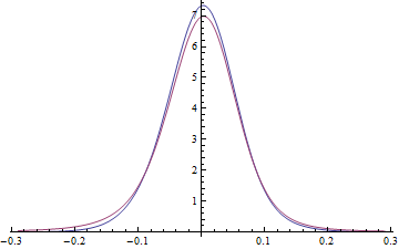
The empirical distribution will be compared to the fit to the stable 2:3 order statistic distribution. This is the distribution which arises from repeatedly selecting the median of three stable random variables. The rationale underlying the use of such a distribution is that it can be seen in the order books of the continuous double auction that limit bid and ask prices contain frequent jumps which show heavy power tails. A stable distribution can conveniently model very heavy tailed behavior but if it is directly applied to logarithmic returns from financial time series, it picks tails which are heavier than the data. The idea here is that many of the orders placed in the price formation process in the continuous double auction never result in a transaction. But what we see in reported prices result from transactions between buyers and sellers. The median order statistic distribution from a stable distribution with maximum rank three provides way to select a subset of random variables representing a compromise between buyers and sellers. It may not be a direct process in price formation, but may ultimately result from many transactions from heavy Pareto tails in the order books summing to something like a stable distribution when looked at over time frames longer than a minute. The selection of this particular subset of stable random variables has the property that it allows distribution tail behavior which has precisely twice the magnitude of the tail behavior of the underlying stable distribution. It is also easy to generate these random variables for simulation.
![]()
![]()
![]()
![]()
The parameters above are in the format {α, β, γ, δ}, where α is the actual tail behavior of the distribution function and the other parameters correspond to the parent stable distribution which has an α which is half the value shown above. The plot below shows the right tail in red and the left tail in blue. The jagged curves are the empirical distribution. In this case the actual empirical data tail is a little lighter (higher magnitude α, or steeper negative slope on the plot) than that of the smoother fit curves.
FFT Model and Empirical Convolution
FFT Vectors and Functions
This next section uses the empirical characteristic function (ecf) derived directly from the data points, where the ecf is defined below and parameter, n, represents the sample size and ![]() is an individual random variable. i =
is an individual random variable. i = ![]() .
.
The ecf is sampled at equally spaced points over a large domain and the inverse FFT can convert this to a sampled density function for the data distribution. An explicit formula for the stable 2:3 order statistic distribution is not known, by me at least, and may not exist, but it can be approximated by sampling the density and using the FFT to generate a sampled characteristic function. Both of these sampled characteristic functions can be scaled to a distribution which is the sum of some number, m, random variables by raising each element of the sampled set to the m th power. In the example m will be 21 to represent 21 trading days in a month, converting the daily distribution of time series of logarithmic returns to a monthly time series. After raising each characteristic function set to the power, it can be inverted back to a sampled density function from which probability calculations may be made, remembering the caveats about the degree of Independence and stationarity of the data.
The density curve derived from the FFT is shown below in red and compared to the density of the fit are shown below. In this case mean adjusted data are used to remove any trend in the data from the convolution process. There are troublesome oscillations in the FFT density curve and because of these, it is not positive definite as would be expected for a density function, but interestingly much of this artifact disappears on convolution.
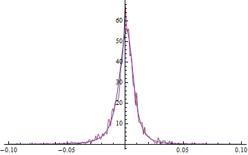
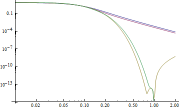
PDF Tail behavior.
This compares model tail to data tail. There basically are not enough points to tell whether the model is good. The tails of the density function are shown on the log-log plot, using the absolute value of negative x. The blue and red are the left and right tails of the fit and the yellow and green are the left and right tails of the FFT derived density.
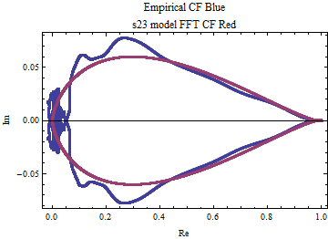
ECF and Model CF Comparison
The plot below shows the points of the ecf and the FFT derived characteristic function points projected onto the complex plane with the real values on the x-axis and the imaginary values on the y-axis. The FFT generated characteristic function is free of the oscillations which are present in the empirical distribution. The range of a statistical characteristic function is confined to the unit circle in the complex plane.
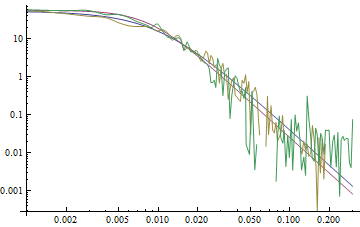
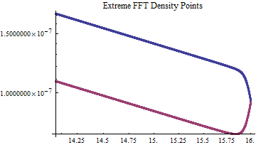
After raising every point in the complex plane above to the 21st power and inverting the FFT, an interpolated density curve is plotted below. The blue and red curves respectively belong to the ecf and FFT calculated characteristic functions.
On the log-log plot of the four density tails the colors are changed. The red and blue belong to the FFT red curve above and the yellow and green tails belong to the blue curve ecf data. The power tail behavior of the empirical distribution has been lost on convolution because the empirical data did not have enough data points on in the tails of the actual data sample to preserve it. The stable 2:3 order statistic distribution was used with enough sampled points to preserve the linearity on a log-log plot of the power tail distribution. As convolution is performed with greater number of convolutions, the linear portion of the curve occurs ever further out on the tails until it disappears after infinitely many convolutions. The model can be used to determine at what point in the distribution the power tails break away.
There is artifact which occurs with the FFT and that is due to aliasing when the two end points of the sampled function are not the same. To avoid having this be problematic a very large sample is used for the FFT, so the aliasing wrap around effect is not significant. The left tail is blue and the right red. The values on the abscissa of both this plot and the plot above are the absolute values of x and the ordinate axis shows the density values.
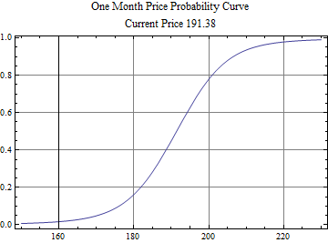
Finally below is a price probability curve using the current price and the one month distribution of logarithmic returns scaled from daily price returns using the FFT of the model density → characteristic function ^ 21 → inverse FFT density → integrated to a distribution function.
© Copyright 2014 Robert H. Rimmer, Jr. Wed 28 May 2014