Influence of Federal Reserve Policy
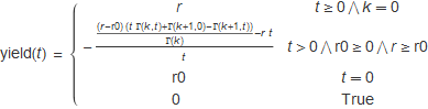
A theoretical model for the yield curve over time, t, is shown below. There are three parameters: r0 is the continuous rate at t = 0, r is an asymptotic long term continuously compounded rate which is reached as t → ∞, and k is a parameter which determines the shape of the yield curve. When k is zero, the yield curve is perfectly flat with the result being a constant rate r, as k increases, the function changes to a shape which is quite similar to that seen in Treasury yield curves.
To study this model over time, daily yield curves from the Treasury website dating back to 1990 were analyzed. The rates were converted to continuous rates by the formula:
![]()
then parameters were determined by fitting data to the yield(t) formula. For charting the rate parameters, r0 and r, were converted back to effective annual rates in percent, to match the daily Fed funds time series. The graph below shows the interesting results.
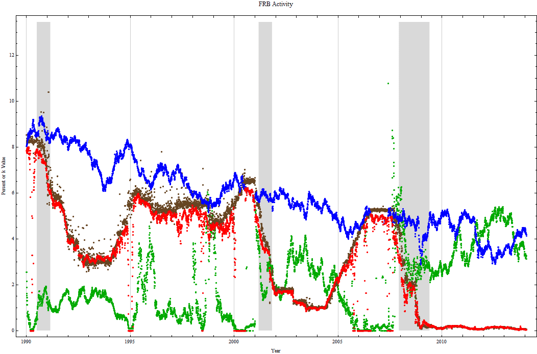
In the graph, r, the asymptotic rate from the formula, is shown in blue. The Fed Funds time series, DFF, obtained from the FRED database is shown in brown. The r0 rate is in red and closely follows the Fed funds rate in brown. The k parameter, which determines the shape of the yield curve, is in green. The light gray background shows periods of officially declared recessions.
While looking at the plots, one needs to keep in mind that the theoretical model does not support an inverted yield curve, nor a curve containing a large hump. The best the function can do is set, k to zero during the fitting. r0 is constrained also and cannot be greater than r. So when the yield curve is inverted, ideally the fit should show r0 = r and k = 0, however, if the data points are very slightly and slowly increasing, the curve fitting can create a high value for k and a value for r0 significantly lower than r. These represent bad fits to data which are not fully consistent with the model, but there has been no attempt to remove them from the plot. They can generally be identified as those points which don’t match the main trend of each plot and occur when k should equal 0.
As the Fed funds rate increases, the k parameter decreases and the yield curve flattens. While the Fed is easing, k rises bending the short end of the yield curve more than the long end. When k is zero the model yield curve is perfectly flat, but the actual data points could be declining or humped with a declining trend. That does not imply that the Fed is no longer affecting the market. Each time on the chart the Fed funds rate becomes higher than the r parameter and the main path of k has been near zero for a while, a recession has followed. Notice particularly the sustained short period of the elevated Fed funds rate in 2000 and in 2006 - 2007, in both cases recessions quickly followed. Prior to this chart there was also a brief period where the Fed funds were higher than the r curve in 1989, just before the 1990-1991 recession. The r0 rate in red follows the Fed funds rate in brown. It is hard to conclude from the chart that the FOMC didn’t play some role in causing recessions. Longer histories of yield curves shown in the appendix show the same pattern for all the recessions in the last fifty years.
The module below requires the installation of Wolfram CDF Player. It can be used to explore how the curve changes as the parameters, r0, r, and k are changed.
Here is a link to more complete discussion (in .pdf form) with complete derivation of formulas and examples of fits to other data series in the appendix.
© Copyright 2014 Robert H. Rimmer, Jr. Sat 25 Jan 2014